Lights on Tampa
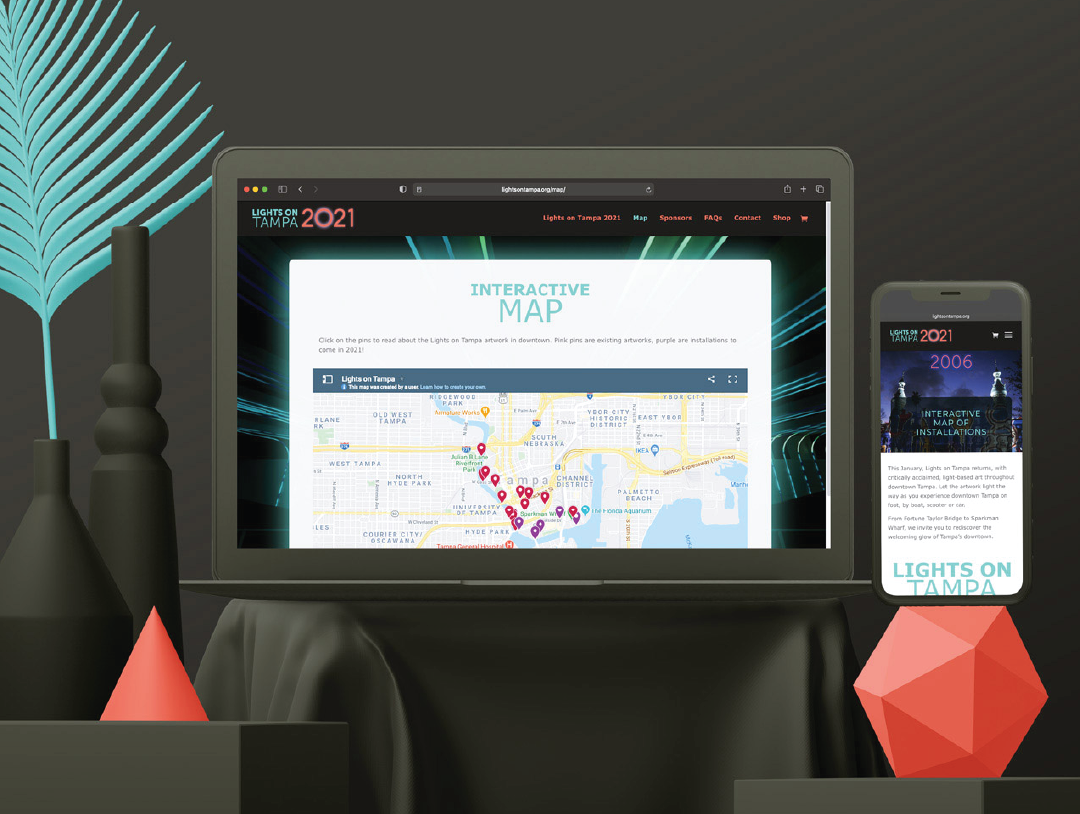
Our creative director, Matthew Morgan, worked with the client to establish an outline of required deliverables for the year’s event. We collaborated as a team to establish a fresh logo mark for 2021 that features a glowing “0” that takes inspiration from one of the year’s featured installations, Channelside Drive Tunnel, by Erwin Redl. From there, I was tasked with designing and building out the site based off the new branding, taking inspiration from the shapes and color palette we established together. The pages display a timeline of previous Lights on Tampa installations dating back to 2006, event sponsors, general info, and an interactive map that allows visitors to quickly locate nearby installations, read a brief synopsis on them, and navigate the walking tour of surrounding installations. With the site up and running, and the event around the corner, the client wanted to offer branded merchandise as a way for visitors to remember their visit and raise awareness about the event. Our solution was to create a two-color dot-gradient version of the logo that “glows” on apparel and other wearables.


